Introduction to Data Visualisation

Visualisation has played a minimal part so far in qualitative research. Why? Why now are data displays increasingly urged on qualitative researchers? And what do they offer for your project?

Visualisation can be useful at many stages in your project, and these are discussed throughout the chapters of Handling Qualitative Data. Chapter 2 suggests the uses of images in the making of qualitative data. Chapter 6 is about the importance of organisation, including visual representation, of ideas. Chapter 9 offers the many ways displays can contribute to the challenges of seeing the project as a whole. Chapter 12 includes the use of visuals in reporting to different audiences. In each area, there’s advice to evaluate visualisations carefully in terms of your research goals.

Here, I provide some more detailed background (or you can download this as a a pdf). 

1. The appeal of the visual

How many times have you been told a picture is worth a thousand words? In the rapidly expanding market of tools for visual presentation of data of all kinds, a web search for ‘data visualisation’ will retrieve several copies of that dubious assertion and many claims for the superior understanding and recall of data presented in images rather than text. But here are three good rules: don’t assume words are inadequate, never merely copy what works in a quantitative context and always doubt an oversimplified picture.

Most of the sources and sites you find urging visualisation are talking about tools for rapid analysis and impressive display of quantitative data in big projects using Big Data. Here the appeal is obvious – a picture is replacing quite often a thousand numbers. The researcher, and importantly the audience can see in the image a pattern that was impossible to find when the confronting the numerical data. So for both the researcher and those receiving a report, the triumph of visualisation is extraordinary and exciting.

Sophisticated software has made imaging immediate and easy, and importantly, analytical. Images aren’t new, but their sophistication is hugely advanced. Our ancestors imaged crops or stars on cave walls and stone tablets, to display patterns. Now computer-based data visualization tools working with massive amounts of information can find and confirm patterns or trends, identify outliers, and make data-driven decisions.

 Keep your distance as least 1 adult kangaroo apartVisualisation has also become part of our everyday communication. The presentation of news and reports digitally has brought imaging of data to mass audiences. The Executive Director of the new Data Visualization Society declared 2019 “the Year Data Visualization Hit the Mainstream.” That was before the pandemic of COVID19, during which even children worldwide learned to “read” a crisis in a curve and respond to social distancing instructions given in images.

The goals of this movement to visualization may sound like your goals. Displays are recommended to help you ‘to quickly comprehend information… to identify relationships and patterns… to identify emerging trends… to tell a story’. But will they assist your (qualitative, small, detailed) project?

It helps to start by asking why words, not pictures, have dominated qualitative research till recently.

2. Why is qualitative data visualisation so limited?

There’s little indication that qualitative researchers are rushing to use the increasingly impressive tools. And there are good reasons for the limited use of visualisation tools in our work.

Start with the nature of our data. Numbers, by their nature, generate images. Words don’t. Sophisticated handling of numerical data, especially large amounts of numerical data, will generate extraordinary visuals – complex, beautiful, fluid and unquestionably useful for both analysis and reporting. Advanced software tools regularly provide new stunning visuals and data handling services support them. A web search for ‘data visualisation’ will find images that would light up any presentation. In academic contexts, new books and tutorials urge data visualisation to overcome boring presentations. But these visuals are almost all generated from and by numbers. Words, by their nature, don’t generate images; the artist has to represent them. A quick sketch will never represent a thousand words, and qualitative researchers are usually not artists.

Stepping back in time, a review of three leading qualitative journals between 2007 and 2009 showed only 27% of articles sampled used any type of data display, providing a total of 377 displays in 215 articles.  Of these, a very high proportion (60%) were matrix displays (crosstabulations).  Here’s a matrix summarizing those results:

table setting our types of display

All these types of qualitative data display are entirely unlike the high-profile data visualisations of quantitative data in either academic or commercial research. They are different in how they are created, in their purposes and their uses.

  • All types are described as researcher-constructs, free-form drawings or representations of interpretations of the data by the researcher. None of the examples appear to have been generated directly from the data.
  • All were created to be tools in the research process, rather than for communicating results. Some were not even used in reporting.
  • Several are so simple (e.g. boxed display) that they would hardly count as ‘data visualisation’ in the world of marketing.
  • None were described as linked directly to the data or claimed to represent data accurately in dimensions or proportions. This is not surprising, since they were not apparently data-generated by software accessing the project. Less than half of the articles reported using specialized software for qualitative data analysis (QDA software).

If the study were replicated today, I would expect a higher proportion of papers to include some visuals, but the types of visuals, and claims made from them, to be similar, with the addition of a few new types of data-generated visuals using QDA software.

Here’s a good topic for a small study – replicate the study described above, for the following 10 years (2010-2019), looking not only at how many visualisations of what sort occurred, but also at how they were generated, how used and the claims made for the visualisations.

In a later paper, reporting the views of journal editors, the same authors commented that ‘the use of visual displays in academic qualitative studies has not varied much in the last ten years… although there are more tools and technologies available to make that possible’. They saw this as a result of ‘scant training in graduate school on how to create visual displays, how to use software to generate visuals, and the lack of tradition to use visual displays in qualitative research.’ (Verdinelli & Scagnoli, 2017, p. 1959.)

But might it also indicate that for many qualitative researchers, the visual displays available to them do little to help them explore or present their work?

3. Different purposes of visualisation

In Handling Qualitative Data, I distinguish between use of visualisation tools in the research process, and in research reporting.  During the research process images may be used sometimes for making qualitative data (Chapter 2), ideally for managing ideas (Chapter 6), and often for ‘seeing the whole’ of a project, and discovering patterns and trends (Chapter 9). At completion (and sometimes earlier) reporting may be helped by visual tools for displaying data, and telling about the research (Chapter 12).

These purposes of course overlap, since tools used for visualisation during the project will sometimes (though not always) be relevant to presentation of outcomes, and sometimes (but surprisingly rarely!) be impressive in displaying results.  Importantly, the design and use of data displays will differ according to their purpose.  Research consultant Lydia Hooper usefully distinguishes ‘exploratory’ from ‘explanatory’ visuals:

As important as exploratory visuals are for increasing your own clarity and understanding, most of the time they will not be the same visual you use to help others increase theirs. The visual you might use as a tool for your thinking will naturally reflect your own particular way of thinking... Whereas I consider exploratory visuals to be about communicating with the data, explanatory visuals are about communicating with others about the data. To be effective, explanatory visuals must reflect the knowledge and thinking not of the creator but of the viewer. Go to the discussion by Lydia Hooper here.

The following sections discuss the uses of visual display in the research process and then in reporting. 

4. Visualisation in the qualitative research processes

While qualitative researchers have always used images and displays, these have been predominantly for exploratory purposes. This is true both of visuals used for data making and those for assisting analysis.

4.1 Displays created for data making

The most obvious use of visuals in qualitative projects is to stimulate discussion or direct an interview, and these techniques are as old as the method. In the study of editors by Verdinelli & Scagnoli, (2017), first responses of some editors interpreted the query about use of ‘visuals’ in journal papers as referring only to the information a researcher collects in the field – pictures, brochures, drawings, etc. – and how such field images can be used in the data making process. Interviewing or field research projects have always used images, for example maps, photos, kids’ drawings, network sketches. With increasing awareness of the relevance of visual material in documenting the social world, such materials may be produced by the researcher prior to the study or created during the study. (Such intervention is a good example of how data can be made interactively by researcher and researched.) Where they are central to the data creation process, they will appear in reports.

For a detailed account of the use of visuals in data making, go to the Methods in Practice account of Mapping Caregiving. The authors describe, with illustrations, how they created and used Ecomaps, interactively, with participants in the projects.

Projects designed for visual display may rely largely on such use of images. For the story of one such project, and ways imagery was used to generate visual accounts for film and website as well as presentations, go to Telling Research, and the story of Going Public with Our True Colours.

4.2 Displays to assist analysis

When qualitative researchers used displays to aid analysis before software assisted, it was usually to sketch emerging ideas or seek patterns or processes being explored. Two sorts of visuals dominated – free-form drawings (models, diagrams or maps) and tables (or matrices).

Models and diagrams

It’s hard to find a qualitative method that does not suggest diagramming or modelling of ideas as they develop. (People, after all, normally express ideas by drawing them, on paper, whiteboards, maybe a tablecloth!)  But Grounded Theory was the first qualitative method to require multiple displays as part of the process of analysis. Termed ‘integrative diagrams’, these are free-form and very varied. ‘The operational diagrams, and perhaps other operational graphic devices, help directly to integrate clusters of analyses,’ (Strauss, 1987 p.184).  Do a web search for ‘grounded theory diagram’ and select ‘images’ to view the amazing variety of displays created for this purpose in Grounded Theory projects. For an account of their role in this ‘constant comparative’ method and building ‘conceptual density’, see Soulliere et al., (2011).

Such diagrams are for aiding the research process, not reporting results. In all the now very different versions of the Grounded Theory method, diagrams are promoted as private analytic tools of the researcher, ‘rarely seen by anyone but the analyst,’ (Strauss and Corbin, 1998: 218).

Diagrams or models were widely accepted across qualitative research methods in the following years and promoted particularly in the influential text by Miles and Huberman (1994). But all modelling was free-form drawing and remained ‘private’ (and unimpressive visually) – doubtless explaining how few visualisations those journal papers studied by Verdinelli and Scagnoli contained.

Matrices

The matrix or crosstabulation triumphed in qualitative work after the publication of Miles and Huberman’s pragmatic work (1994). Matrix displays were only one of over 60 methods of data display and analysis described, but by far the easiest to insert in any report, since all studies have data that display in tabular form. Computer support followed, and as mixed methods research grew, qualitative researchers learned to display in a matrix many different sorts of data – sample characteristics, attitudes, coding categories.

Does it help your research process to ‘visualise’ your data in a crosstab? If the issues and questions you are asking about usefully break into the columns or rows of a table, the matrix may be very clarifying. Perhaps a matrix of age by attitude to conflict shows more younger participants than older ones are tolerant of aggressive behaviour. But are the numbers what you want? If you aim to disentangle their different interpretations of conflict, their words will be required; numbers in the matrix may seriously oversimplify. And just a few ‘typical’ words may mislead.  For me, this is a personal story of method and software intersecting.  At a seminar with Matthew Miles in Melbourne, I expressed concern at the easy distortion of interpretation when a matrix cell was illustrated by a ‘typical’ quote. He cheerfully agreed, and threw out the challenge, “If your software is that smart, teach it to give me all the material that belongs in each cell.’ So, we did – the software, then NUD*IST rev 2, acquired the ability to save each cell as a new node, coding all the data represented by the cell. Now you could read and analyse what those young people said about conflict and tease out how different were the themes from the statements by older participants. All qualitative software now in some way supports matrices and most give access to the relevant contacts of each cell.

A picture may present one way of seeing a situation but it can’t debate other ways or ask how the participant sees things. In qualitative, as in quantitative research, visual representation will help you discover patterns and links that were hidden in the data. ‘Data visualisation offers us the ability to view data in different ways and gives us a better chance of detecting obscured patterns and connections” (Azzam & Evergreen, 2013, p.3). But in qualitative work understanding that pattern almost always requires a return to the data – that’s why you delayed data reduction, and why you are working qualitatively.

There’s a moral here. Never let data visualisation tools replace words – they do different things. Combined, they are formidable.

4.3 Doing visualization with software tools

Clearly, computers can create superb displays of complex data. You don’t even need specialized software to get some displays. So, start by finding out what is offering in your everyday software, then explore the niche software for (usually academic) qualitative research that goes by the acronyms of CAQDAS (Computer Assisted Qualitative Data Analysis software) and QDAS (Qualitative Data Analysis Software). I refer to this dedicated software simply as ‘qualitative software’ or QDAS. (In Australian slang, if something is ‘cactus’ it’s dead, and qualitative software is very much alive.)

4.4 Visualisation tools available generally

First, what’s already on your computer? It will mainly offer simple visual representations of numbers, but this can be useful, for example to display characteristics of your sample, compared with the wider society. These displays can be created easily and cleanly in the basic computer programs you use already. If all you want to display is a visual representation of attributes of respondents or numbers of responses, select Insert in Word or Excel, to view options to represent your data in many different charts or line graphs.

Insert menu in Excel and Word

Google Data Studio is a free toolkit – click here for an introduction.

Inspiration for attractive relevant displays may come if you browse the tools and techniques being developed for the wider worlds of marketing and business. In those contexts, qualitative data are highly valued but always challenging because timelines are tight. Do your own searching for up to date summaries – there are new commentaries appearing all the time. At the time of publication, thorough reviews of a wide range of products for qualitative research are offered for example by PAT research; try them out in free demo versions. See also this summary of the ‘best analytics tools for data visualisation’ in May 2020. For a taster, explore the links – and the adjectives! in this blog entry.

4.5 Why use QDA software for visualisation?

Now, consider the visualisations offered by the ‘QDAS’ software programs designed for (and usually by) researchers in the academic context. Start with the section on this website on Qualitative Software. For current functionality of any package, and for tutorials and help, go to the website for that software product. For those websites, see the CAQDAS site. For examples, tutorials and the all-important visual images, search online, and if there is a recent text about the software you are considering, read it. Links and References are at the end of this page.  Software upgrades regularly and visualisation tools are currently being prioritized, so any specific descriptions of functionality and any illustrations would be out of date by the time you read these pages. Instead, what’s offered is an overview of what you should be able to find in QDAS packages.

Not surprisingly, programs developed for qualitative researchers (usually, at least originally, by researchers with low budget) are less slick and not nearly as quick as those available in the wider world of marketing and business. And as already pointed out, numbers generate elegant images much more easily than words. So, the displays created by QDAS tools are far less attractive and sophisticated in presentation than those for numerical data.

So, for visualisations, why use QDAS tools? The answer is simple – in software developed for qualitative research, your project is in the software. Visuals are generated from the data and will always be linked to your data and analysis. They can display the content and shapes of your project. Manipulation of the display can take you to places in data records as well as to the results of your interpretative work – coding, linking etc. It’s critically important to distinguish the uses of an image of your coding, a model or a matrix that is linked to the data in your project from display you draw, that is unlinked to data.

 Importing sources from CSV

The world of QDAS tools is responding to the call for visualisation. A recent arrival on the scene, 

Quirkos presents visually, with the promise that, “Everything is visual, colourful and engaging.” This offers a refreshing change from the more confronting interfaces of the older products, and some new ways of seeing your data.’ Check out the images here.

Established products are now emphasizing data display in upgrades. See for example the illustrations for visualisations in the current version at time of writing of MaxQDA. These are summarized in the table below prepared by the CAQDAS team. For these and other reviews, click here. (Always note the date of a review and always check the software site for any updates!)

 MAXQDA visual tools

Importantly QDAS products are also making access to these displays easy and interpretation clear. See for example this tutorial on visualisations with ATLAS.ti.

Note there is not a clear divide between commercial and academic software. Both are used across both markets. In the academic world, the more commercially driven QDAS companies have tended to market to the lucrative worlds of advertising and business, sometimes purchasing professional presentation tools and adjusting to the terminology used in wider markets.  Software being marketed beyond research worlds may be very useful for your work, particularly for presentation.  (See for example the current presentation of three types of ‘maps’ in NVivo - termed ‘models’ in previous versions.)

NVivo maps

4.6 Visualisation options in QDA software

Visual representation of project data came late to the programs designed for qualitative research, and some of the newer programs have no special tools for imaging either data or the research process. Expect that your program, even if it is not emphasizing visuals, will provide some tools that can be used for display.  New tools are appearing frequently. There’s a recent introductory account here.

There are four major groups of visualisation tools to expect (for now) from most QDA software. For how a tool works and how it looks in a program, go to the developer’s website. Links and References are at the end of this section.

4.7 Displays of coding and codes

As explained in the section on Qualitative Software the early programs concentrated on supporting the coding of textual data, and all programs since have had that as a central function. Visual representations of coded data were a later addition, along with visual representations of coding categories. All programs now show in some way your coding of data or of selected data records (see Chapter 5). These displays use highlighting, colour, margin marks or other indicators to show what you coded. If you have a choice of QDA program, check coding displays as they vary widely and some will suit your style better than others.

All programs will also display the categories created for coding, most showing a logical index ‘tree’ structure if you have used one (see Chapter 6). Most display in some way the amount of coding at (optionally selected) categories, supporting assessment and revision of coding practices. Some display overlapping of coding, informing searches (see Chapter 8). Visualising codes graphically and moving them around can facilitate the process of creating logical groupings and efficient access to codes.

Go to Telling Research for the presentation on Telling it to Your Supervisor to see how these displays can be used in communicating the development of your project.

Programs differ in their representations of coding and how interactive those displays are. For example, Dedoose highlights coded excerpts in the source, and allows you to assign weight to codes and coding.  Designed as a mixed methods tool, it offers a range of displays, from charts to bubble plots for viewing coding displays – check the tutorial here – and plots with options for statistical output. (See Salmona et al, 2020, Chapter 8.)

Matrices or crosstabulations

As discussed above (see also Chapter 8 of Handling Qualitative Data), crosstabulations are a long-established display for seeking and exploring patterns in data. Recall that matrices were by far the most common visual display in publications studied by Verdinelli & Scagnoli, (2013). They are most used to cross-tabulate respondent characteristics by categories or themes (e.g. age of respondent by attitudes to an innovation). The tables will display numbers or a user generated text summary. Often more interesting are crosstabulations of coding – how are attitudes to an innovation patterned by, for example, acceptance of scientific authority? Such explorations may drive interpretation of the data. All you need is a coding system ordered hierarchically - see Chapters 5 and 6 in Handling Qualitative Data.

The illustration below shows how Dedoose presents just one of the options for such an exploration. The highlighted cell in the table ‘indicates that 10 excerpts or overlapping excerpts were coded with both the ‘Bedtime Reading Routine’ and ‘Reading by Others’ codes…  Drilling down to the underlying qualitative data (by clicking the cell and reviewing the excerpts) provides a deeper understanding of the participant reports. (From Silver and Lewins, 2014, Student Resources).

Code co-occurrence table

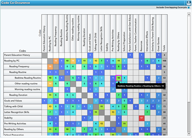
As explained above, when the QDA software allows that a matrix can be interactive, a click on a cell will show all the text coded there. Packages differ in what you can then do with that output, but at the least you can read it, explore those words. (Yes, it has returned you to the words.)

Visual representation of ideas and theories: maps or models or diagrams

These are now available in most QDAS and most are very useful for sketching ideas or displaying relationships. Simplest are networks, showing selected items and links between them, drawn by the researcher and indicating their interpretations.  ATLASti led the way with network displays, and now offers a highly flexible range of input and layout options: go to the video tutorial for current functionality.

maps and diagrams

Maps and models and diagrams can help you puzzle through your understanding of the data, especially if the software allows you to ask for the data coded at an item or information about a link. Most QDA software now produces such diagrams based on information you have stored by coding or linking project items (records, cases etc.)  As commented above, it’s important to see the difference between the sketch of your ideas on the tablecloth and the model you draw in your project in software.  Freeform models do not require QDA (or any) software and do not offer access to your data. But if your model is in QDA software, it is linked to the data.

Interestingly, one branch of the now very divided Grounded Theory method explicitly rejects such software. For a discussion of all the issues here, see Buckley & Waring (2013). However, computer generated diagrams are now widely used in studies using grounded theory and several QDA packages promote their use in this method, emphasizing the advantage of access from the diagram to the data. (Tutorial on using MaxQDA for this method here.)

Packages vary greatly in the sophistication of the maps they will draw; if modelling your data or your thinking will matter to you this may be a significant reason for choosing a particular software product. Go to the developers’ sites and seek tutorial displays. If you wish to display models in your presentations, seek the ability to jump from an item on the model to a case, an image or a quotation. This can bring a presentation alive, taking the audience directly to the data. But critically assess the clarity and layout of those models – how will they look on a screen?

If that is not relevant to your purpose, and the model in your software is complex and looks unimpressive, you may be helped by using a commercial drawing tool aimed at impressive modelling tools or ‘concept maps’ aimed for clarity and attractive presentation. Examples abound – here’s a model of complex factors taken from one format to another.

Word ‘clouds’, word frequency and/or associations

Word clouds offer visual display of the most common words in small or large amounts of text you provide. QDA software came late to this game; programs for word ‘clouds’ have been around for much longer in the commercial world (and there they are widely criticized and regarded as old hat.) QDAS options now abound, not surprising, since the functionality has been around for a long time. All indicate frequency of words in the data by font sizes and most give a range of ways of narrowing the search. Some programs offer more grabbing presentations (click here for the display in MaxQDA) or a menu of options for complex enquiries leading to different displays of frequent words and their context (here’s the process in NVivo).

But hang on - is that what you wanted to know or show? You know your data, and can almost certainly predict the most commonly occurring words. Even cleaned up, with exclusions for trivially common words, etc. the display tells you frequency of use of a word, not how it was used, in what context or by whom and what it had to do with – well, anything!

If you plan to use word clouds, try improving the result, informed by this discussion. And check back to Chapter 8 in Handling Qualitative Data for discussion of text search and its limitations. Many websites will provide a word cloud for free, so you can have fun creating a test, and spend (waste?) time changing specifications, colours and even shapes of the ‘cloud’. It won’t convey as much as the words in context. It will however make a great display – if, that is, your project is concerned with frequency of words. It probably isn’t.

Here’s a batty word cloud of my text for this webpage, doubtless confirming your impression of its main topics.

Word cloud in the shape of a bat

Word Cloud of this webpage as a Bat, generated (for free) by https://www.wordclouds.com/

4.8 Exploratory or explanatory?

There are a huge range of options, then, for exploratory visuals in qualitative research process – if they are used well. But what about reporting: do these perform well as explanatory visuals? Pause to consider the audience, what they are being taken to, and how they will receive and interpret this visualization. (Explore the literature on ‘knowledge brokerage’ in this context – see Allen, 2018)

Just as visualisation in early qualitative work was for analysis, rather than reporting, so too software supported displays were geared to the main goal of managing and coding unstructured data. Most still are not intended for presentation. And frankly, they too often present poorly, as any attendee at qualitative conferences will attest.

When QDA programs provide a way of creating models or maps of what you see in the data, these may look less impressive than drawings done with generic software or by hand. Freehand sketches by researchers with no drawing skills may help you make sense of the data but they will hardly impress stakeholders or conference attendees. If these are intended to be ‘private’ to the researcher, they’ll fail as ‘explanatory visuals’.

Some QDA software has more recently provided output that presents more clearly. Sharper images and clearer delineation of segments (with colour, spacing etc) make these tools more useful for reporting as well as exploratory work and allow presentation that fits the audience’s expectations.

TIP! Check what your images look like from a distance, projected on a screen, before including them in presentations. Check that you can clearly explain them. And check with dummy audiences that they are not only visible but understandable.

By contrast, the primary aim of software tools developed in the commercial world for marketing and business is presentation – to display trends, patterns or processes clearly (and attractively), to teams, during the project, or to clients at conclusion of the task. Your reporting aims are more likely to be writing up in detail and presenting briefly the outcomes of your work. In both the written report (Chapter 11) and other presentations (Chapter 12) words will normally be your main tools. But explore how visuals may assist. Find examples on the web of display whose messages are clear and exciting – and emulate them.

It’s worth reading accounts of how visual displays can assist a business – for example the task of customer tracking. In house or in presentations, the audience is helped to ‘comprehend information’, ‘identify relationships and patterns’, ‘identify emerging trends’ and ‘to tell a story’. Sounds like your task?

4.9 Stepping into visualisation for your project

In a qualitative project, unless it is designed for a visual outcome, almost always words are necessary and images complementary. Start there.  Well-chosen words set up a project and invite participation, aided where it’s useful by images. Analysis processes may be informed or sometimes even initiated by visual representation but these are not a substitute for your reflexive memos and logging of research process.

Similarly, in reporting, data visualisations are complementary to words. Displays adequately portraying the data will help you avoid writing reports that are boringly wordy or delivering sleep-inducing presentations overloaded with long quotations. But you’ll still need words, (and the skill to choose them and edit them carefully) for project reports (see Chapter 11). Your presentations will still need words to tell short stories sharply and vividly (Chapter 12).  And the visualisations must be relevant to the audience, reflecting ‘the knowledge and thinking not of the creator but of the viewer’.

When, and where, would you consider using these tools? Here are suggestions, following the order of chapters in Handling Qualitative Data, of ways you might use displays in your own project:

  • Chapter 1: Setting up – can you see the structure and stages of your project proposal clearly? Can you see the issues to be tackled and the timetabling necessary as you approach the research field? Would it help to see these as a flow chart? And that issue of planning communications – you need a table for this (See Table 1.1 in Chapter 1 for possible content.)
  • Chapter 2: Making data – can you map the different sources and sorts of data to be brought together in this project and set out timing? Is there quantitative background data to be considered e.g. to compare your sample with wider populations: display these in charts? And can you use visual prompts to inform interviews or accompany field research?
  • Chapter 3: Data records – use a table or a flow chart in setting up to record the flow of your data storage system.
  • Chapter 4: Up from the data – here’s where a model will greatly assist your work, so find what modelling your software will support, or use other software for free-form modelling to display and reflect on different ways you are seeing the data. Draw a model of what is going on in an early document, the issues being discussed or the reasons for a response. Save the model, to compare with the picture of what’s going on in the next document.
  • Chapter 5: Coding – all QDA software displays coding in multiple ways, including what has been coded and at what categories, density of coding and overlaps. You need to be well prepared to use all the ways your software can show your coding and the relationship between codes. As you work, save screen shots of your coding for later display.
  • Chapter 6: Handling ideas – all QDA software will display in many ways the codes/categories you create and usually their relationships in a catalogue or tree structure. Using these displays often and thoughtfully, you can monitor the development of ideas and the relevance of data documents as indicated by the coding at categories. Archive copies of the category system during the project to show how it grows. Share images of it to discuss with your supervisor (see Telling it to Your Supervisor)
  • Chapter 7: What are you aiming for? – eight possible outcomes are sketched in this chapter, and each will be clearer for your consideration and for discussion if you display how they would work in your study. This is an opportunity for wild free-form drawing!
  • Chapter 8: Searching – back to the visual resources in your software, as all QDA software will display searches of coding and of text in several ways. Take time to experiment – especially with displays that may generate questions (Try a word cloud to supplement text searches that ‘fetch’ what you specify.)
  • Chapter 9: Seeing a whole – here’s where the range of visuals is at your service. The goal is to get above the complexity and confusion of the mass of data and start seeing its story. Modelling is only the most obvious tool to use. Explore the ways of seeing and critiquing coding patterns.
  • Chapter 10: Getting it together – did you map the different sorts of data documents earlier on? If not, it may help to sort them in a table or diagram as you conduct the ‘stocktake’ of data.
  • Chapter 11: Writing the project report – reach for displays generated during the project, not just new ones attempting to illustrate your conclusion. Any, if not all the, ways of portraying data and research processes above may show the development of your account of the data and inform the final report.
  • Chapter 12: Telling it – it’s time to create new, special, grabbing visuals that elegantly show your work in brief presentations. Consider using software created for commercial presentations, especially if you are presenting to stakeholders or clients. Use simple charts for quick presentation of context, e.g. of how representative your sample is. Be highly critical of visuals designed for research process that will confuse an audience (and often be obscure or illegible in a presentation!) Can you represent what it showed – in a clear image?

4.10 Top tips for using visualisation in your project

It’s not a requirement of any qualitative research that it uses data visualisation. The suggestions above offer ways you might be helped by doing so. At each stage of your research, call on the basic principles of qualitative method as you consider and select ways of visualising your data. Here are some:

  • Don’t assume words are inadequate, and always doubt an oversimplified picture.
  • Never treat words and images as alternatives. You need both. Ask at every stage, would a picture complement your efforts with words? How would it help this interview to display a network or a photo? Would it assist this analysis process to image it?
  • Other things being equal, use images only when they clearly do better than words.
  • Studiously avoid the temptation to assume that a tool must be used just because it’s there. Explore how others have used it. Go for advice and examples to the expert books on your chosen package, and/or the tutorials on the developer’s website or other websites listed below. Study the accounts of uses of these displays and play with their relevance to your project
  • Aim to display clearly any data visualisation that is critical in your analysis, during the research process or at reporting stage. Don’t tolerate messy sketches. Test them by telling them to your team or an audience.
  • Be guided by your method. Does it use visual display and are you clear about the purposes? When data can be represented visually, ask if this fits with your method.
  • Now to your software: what does it offer, and does that fit with your questions and your data? As with all software use, avoid pressure to use a process just because your software supports it or because it’s fashionable. Study the accounts of uses of these displays and play with their relevance to your project.
  • Always consider whether a display may distort the message you want to deliver. Does it oversimplify? Does it emphasize frequency of occurrence over significance of this theme?
  • Ask always what’s needed and what would assist you to see what’s going on in your data, and to tell it to others. Get into a habit of asking what you need to see. What can’t you see? What feels opaque?  Now evaluate the tools available.
  • Guard against skewing your analysis or presentation to stuff that can be displayed attractively visually. Beware the easy access to a clear and striking picture. Most qualitative data are not like that.