The SAGE Handbook of Online Research Methods
Colour illustrations
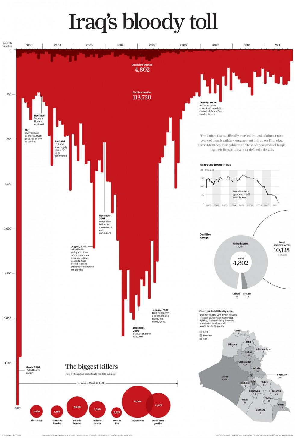
Figure 18.1: Iraq’s Bloody Toll, by Simon Scarr, published in the South China Morning Post on December 17, 2011

Figure 18.2: Iraq: Deaths on the Decline, by Andy Cotgreave, published online at http://gravyanecdote.com/uncategorized/should-you-trust-a-data-visualisation/ on October 16, 2014

Figure 18.3: screengrab from the Seeing Data website showing 14 common chart types, http://seeingdata.org/sections/inside-the-chart/

Figure 18.4: ‘The purpose map’ by Andy Kirk (2016)

Figure 18.5: EU-Born Residents as Share of Local Non-UK Born, England and Wales

Figure 18.6: Screenshot of ‘Migration in the Census’, Comparative View

Figure 18.7: Modifiers of ‘Immigrants’ in the Tabloid Press, 2010-2012

Figure 18.8: Modifiers of ‘Immigrants’, All Publication Types, 2010-2012

Figure 18.9: Screenshot of Frequency Analysis with Annotation, All Publications (a work-in-progress version of the interactive ‘Migration in the News’ visualisation can be found at www.compas.ox.ac.uk/migrationinthenews.)

Figure 18.10: Screenshot of Modifiers of ‘Asylum Seekers’, All Publications