Analyzing Social Networks
Chapter 7: Visualization
7.11 Problems and Exercises
› Click here to download corresponding data
1. We have already looked at ordination methods such as MDS in the preceding chapter. But there are other ways to orient the nodes in a graph. The chapter discusses the use of graph layout algorithms, as well as ordination methods, to orient the nodes of the network in a two- or three-dimensional space. For the scientific collaboration proximity matrix in the last chapter, use the spring embedder for placing the nodes in space. In NetDraw go to File|Open|UCINET Dataset|Network and open “Science_Collaboration.##h” (the default orientation of the nodes is a spring embedder). How does this spatial representation of the network compare to that produced by the MDS?
Spring embedder of scientific collaboration network
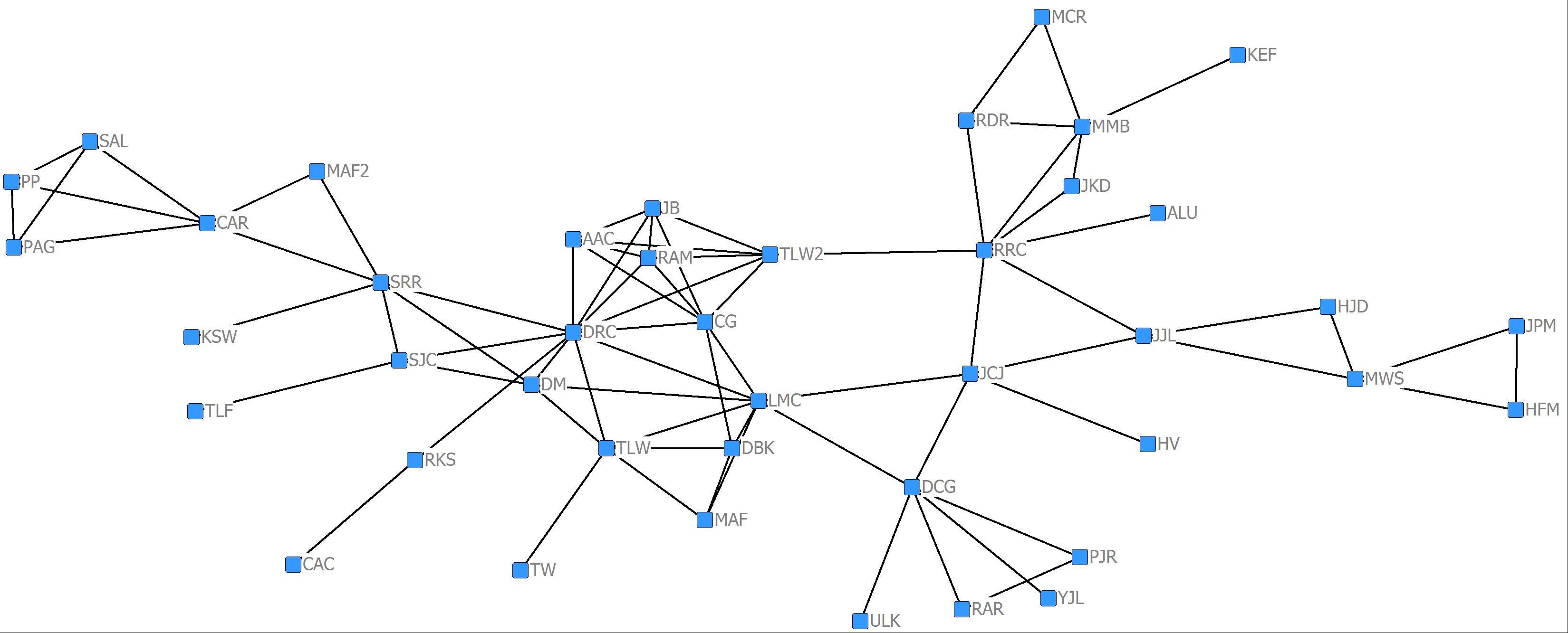
The spring embedder facilitates a clearer visualization of the network, but unlike the MDS, we cannot interpret the distances between nodes as necessarily meaningful. However, the core and chains are still evident in this visualization.
2. We often want to convey information on the graphs that reflect the attributes of the nodes and the edges such as gender, age, strength of ties, etc. To convey such information, we can vary nodal size and shape and for valued networks the size of the edges.
a. Using the “Science_Collaboration.##h” data, visualize the network using the procedure as outlined in Problem 1 above. After visualizing the network in NetDraw we need to bring in a data file containing attributes of the nodes. To bring in the attribute file you go to File|Open|UCINET Dataset|Attribute data and load “Science_Attributes_All.##h”. The data file contains three nodal attributes: Affiliation (academic discipline), Gender, and Sum (a measure of centrality for valued data discussed more in Chapter 10). Although you can’t see the attribute data, they are in the background and ready for use. First we want to color the nodes by the academic discipline of the researchers. Go to Properties|Nodes|Symbols| Colors|Attribute-based. Click on the Select Attribute pull down menu and select Affiliation and click on the green check mark. The nodes are now colored by academic discipline. Do researchers collaborate mostly with researchers of the same discipline?
The general tendency is to collaborate within your own discipline, although there are some obvious research projects that span disciplines.
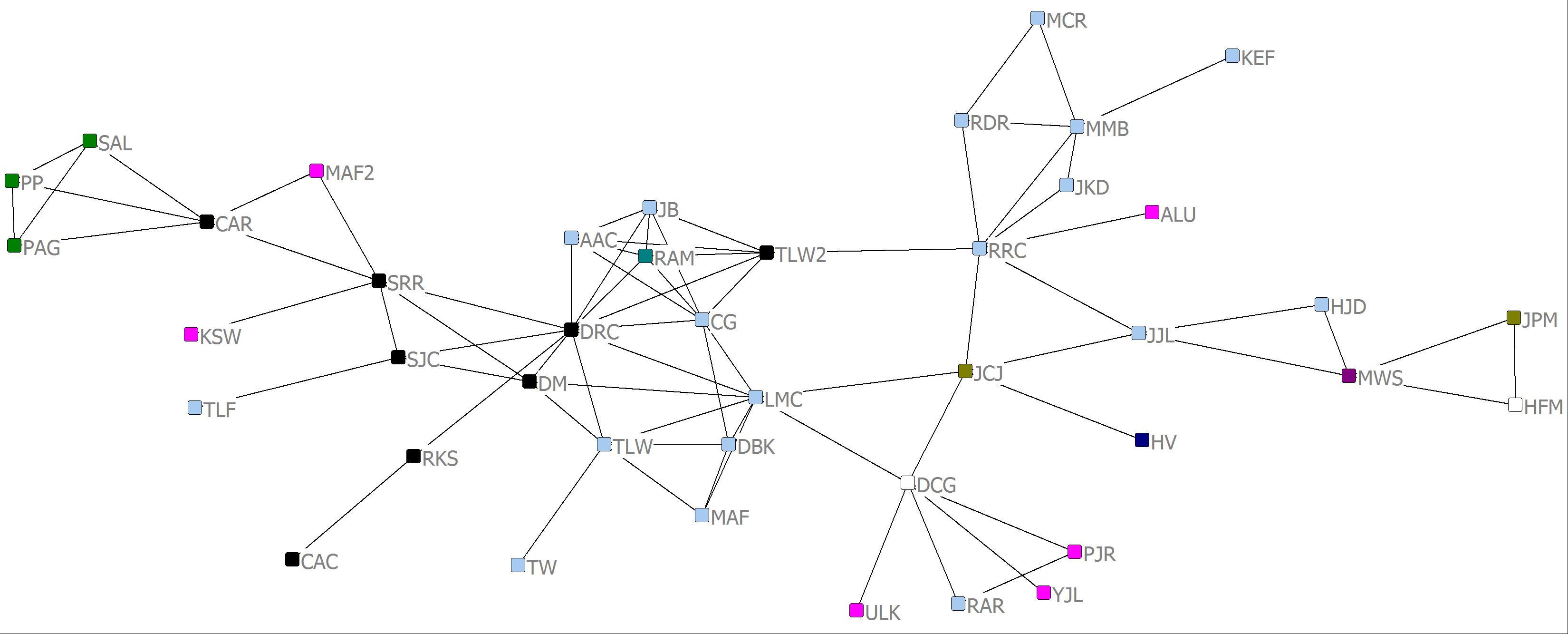
b.The shape of the nodes can be varied to reflect a qualitative attribute of the node such as gender. Go to Properties|Nodes|Symbols|Shape|Attribute-based. Click on the Select Attribute pull down menu and select Gender and click on the green check mark. There are five women researchers in the network. Do women researchers tend to collaborate with one another?
Of the five women in the collaboration network, none have any grants in common. Therefore, at least in this network, women do not tend to collaborate.

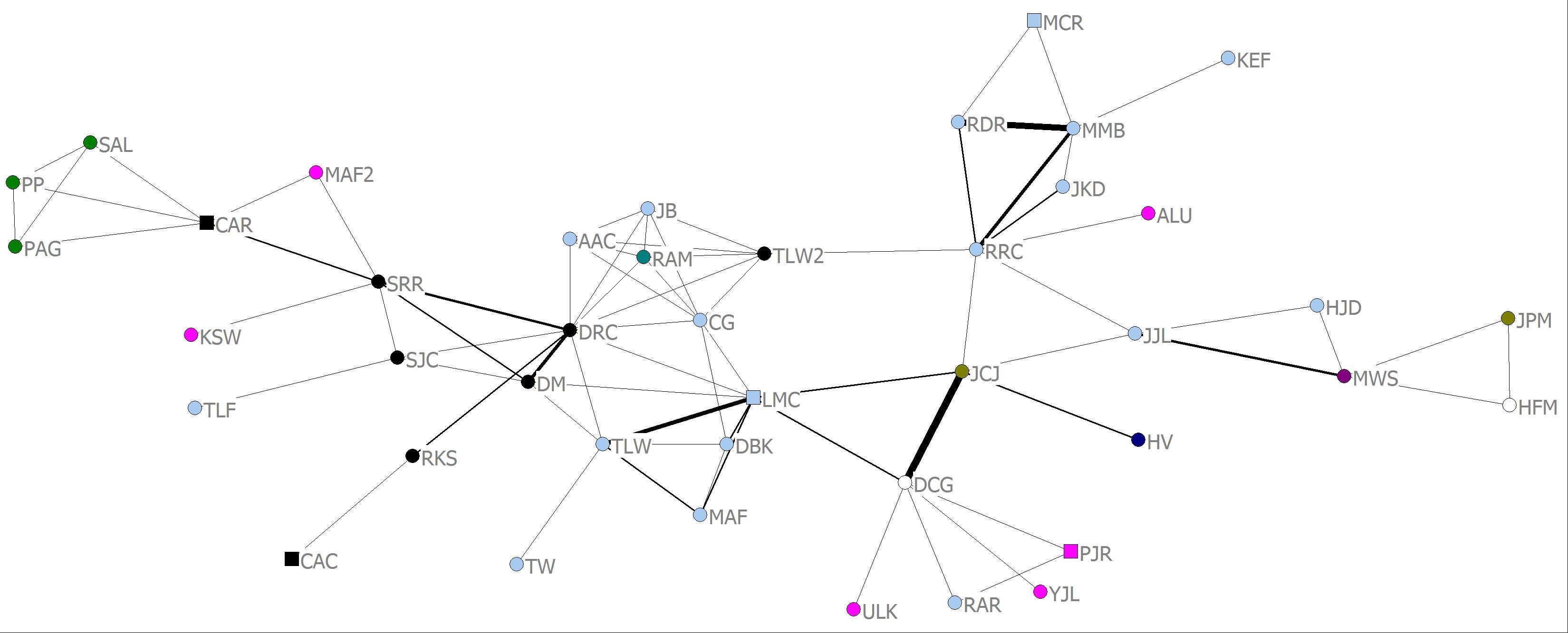
c. The science collaboration network is a proximity matrix. The edge value between two nodes reflects the number of research grants they have in common. Therefore we can visualize the strength of these collaborations between pairs of actors by making the size of the edges proportional to tie strength. Go to Properties|Lines|Size|Tie Strength. Click on the Select relation pull down menu and select Science_Collaboration and click on Apply. How might you characterize the distribution of strong collaborations in this network?
There are several strong relationships. These include DM and DRC who are both geologists, JCJ and DCG who are both anthropologists (but not in the same department), LMC and TLW who are both ecologists and finally RDR, MMB and RRC who are also ecologists (these were the three ecologists who were on top of one another in the MDS in the Chapter 6 exercise).
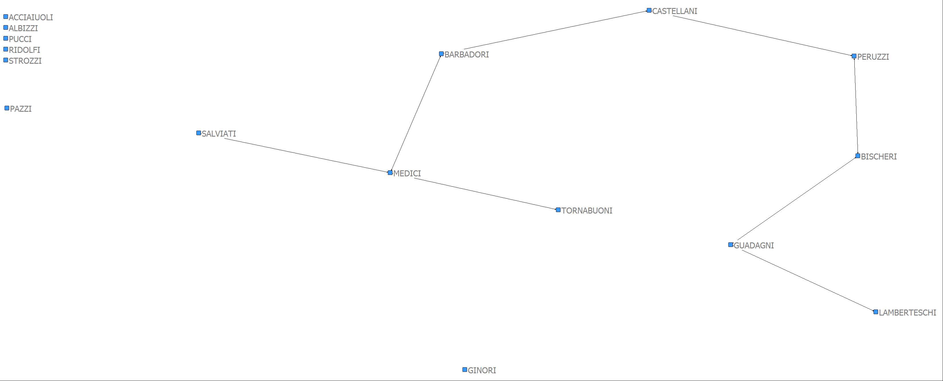
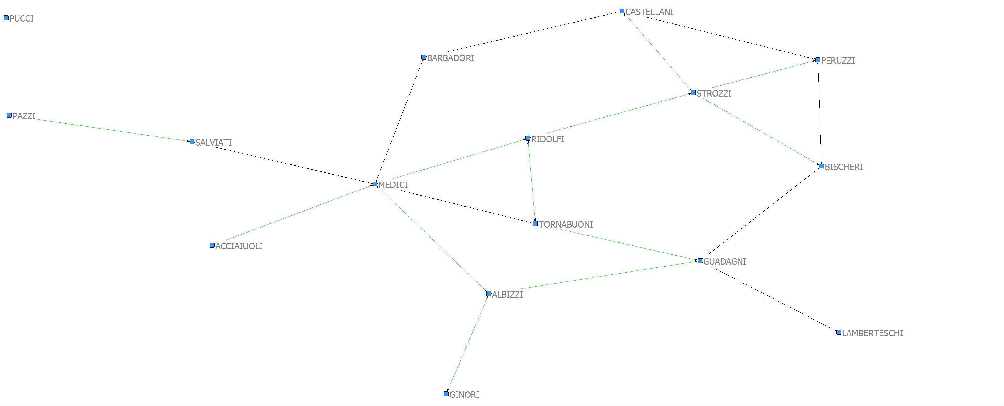
3. Often data are collected on more than one type of relation and it would be important to visualize two or more kinds of ties at the same time. Using the Padgett dataset (PADGETT.##h) in NetDraw, open the data file. In the “Rels” tab to the upper right, check both PADGM (marriage ties) and PADGB (business ties). Now go to Properties|Lines|Color|Relation and make the multiplex ties black, the marriage ties green, and the business ties blue. By multiplex, we mean that both kinds of ties are present at the same time. Now show only the multiplex relationships. To do this, in the Rels tab check PADGM and uncheck PADGB. Now click the AND radio button. Now check PADGB. You should see lines only for pairs of nodes tied by both kind of ties – just the black ones. Next save this as a new relation by clicking “Save as New Relation” at the bottom right. Call it “MPX”. Then use the Dn button (bottom right) to show (a) nodes tied by marriage (and possibly business), (b) nodes tied by business (and possible marriage), and (c) nodes tied by both business and marriage. What would you conclude about the multiplexity of relations across the different types of relations?
There is a clear multiplexity of ties given the high degree of overlap in both marriage and business ties. The overlapping nature of the business and marriage ties is one of the ways the Medici family gained power and influence in Renaissance Florence.
Marriage Ties
Business Ties
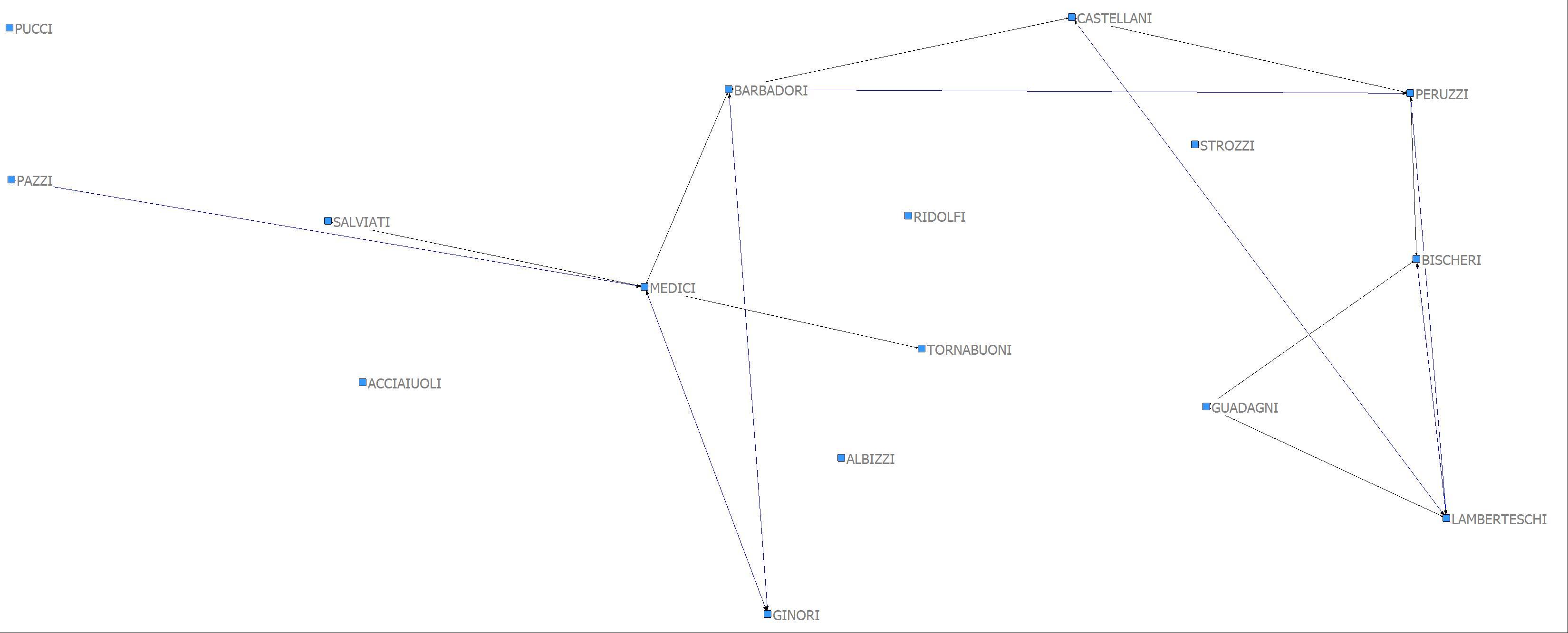
Multiplex Ties