Using Software in Qualitative Research
A Step-by-Step Guide
Chapter 13 – Interrogating the Dataset (Dedoose)
Chapter 13 discusses interrogation that can happen at varied levels and at many moments during analysis. Interrogation can happen by simply retrieving coded data; in more advanced ways or with a focus on mixed methods interrogations also happen in terms of discovering relationships between codes which co-occur in some way in the data. You may need to compare codes across subsets of data (indicated by the application of variables, descriptors or attributes to data). Types of queries vary from simple to complicated tasks; summarized, charted information where the results are already available in the background, is available in Dedoose. See all coloured illustrations (from the book) of software tasks and functions, numbered in chapter order.
Sections included in the chapter:
Incremental and iterative nature of queries
Creating signposts for further queries
Identify patterns and relationships
Qualitative cross tabulations
Quality control, improving interpretive processTables and matrices Charts and graphs
The Dedoose Analysis Workspace menu provides quick, easy access to the variety of charts, tables, and plots that are pre-programmed into Dedoose. Once documents have been linked to descriptors and excerpting activity has taken place, these data visualizations automatically populate. The different reports and various controls within each provide a variety of flexible approaches to understand, organize, and present your data.
Access the Analyze Workspace by clicking the ‘Analyze’ button on the Dedoose main menu bar:
![]()
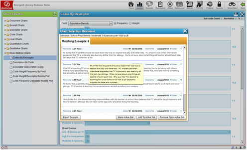
The sets of interactive charts are organized in a folder system so it is easy to find what you are looking for depending on the immediate needs of your work. Simply activate the chart, table, or plot you are interested in, select the variables of interest (where appropriate) and other specifications given the controls of the particular chart, and you are analyzing your data. Then, to drill into the qualitative excerpting and coding represented in the visualization, just click the bar, cell, bubble, or slice of pie to pull up the underlying excerpts. From the resulting chart selection reviewer, you can browse, recode, or export the data for use in other software.
In Depth
The Dedoose Analyze Workspace is where all your data come together for many of the activities related to exploring, analyzing, and interpreting project data and preparing for presentation. Like many Dedoose features, how Dedoose best serves each investigator is personal and different approaches will fit different styles and needs. The charts, tables, and plots in the Analysis Workspace will serve virtually all of the needs for many researchers in terms of presentation graphics, filters, and other tools for the syntheses of research findings. The best approach to discovering how your style will be served by Dedoose is to explore and experiment using the main Analyze Workspace features that will be described and illustrated here. A noteworthy point is that the results of all exploration and analyses can be exported into text, MS Excel, or PDF formats for use in other software.
The Dedoose Analysis Workspace menu provides quick, easy access to the variety of charts, tables, and plots that are pre-programmed into Dedoose. These displays were designed to provide the researcher with fast access to many commonly applied approaches for exploring, filtering, analyzing, and presenting data. You will quickly see how you can use Dedoose to achieve both very general and very specific ‘looks’ at your data. The different reports and various controls within each provide a variety of flexible approaches to understand, organize, and present your data.
Analyze Workspace Features
Access the Analyze Workspace by clicking the ‘Analyze’ button on the Dedoose main menu bar:
![]()
The Analyze Workspace offers a number of chart ‘sets’ based on the various sections of the database. The sets are organized in a folder system so it is easy to find the charts, tables, or plots you are looking for depending on the immediate needs of your work. Here’s an example of the charts in the ‘Mixed Methods’ set.

Dedoose Analyze Workspace Mixed Methods Chart Menu
It is also worth noting that a number of the charts, tables, and plots will appear in multiple sets within the ‘Chart Selector.’ For example, the ‘Excerpts Per Document’ chart will appear in both the ‘Document Charts’ and ‘Excerpts Charts’ folders.
Overview
The Dedoose Analyze Workspace offers a wide variety of data visualizations. These visualizations can be used to examine the general nature of your data, understand how the code system has been applied to the qualitative content, and expose patterns of variation in the qualitative data and activity across sub-groups. They can also be used for the presentation of research findings, and as filters or windows to drill deeper into findings.
These charts, tables, and plots are informative, intuitive, and transparent. They can be used in numerous combinations and be flexibly adapted to address particular research questions.
For many of the charts, Dedoose provides the ability to toggle between a bar or pie chart visualization. The highlighted section of the screen shot below (in upper right corner) shows the control buttons for pie chart, bar chart, and export.
TRANSPARENCY? Fundamental to the Dedoose design is transparency and what this means is that users should move smoothly and knowledgably through all the data that Dedoose helps bring together. In the Analysis Center and throughout Dedoose, every bar, slice of pie, bubble, and cell in a table is ‘HOT,’ i.e., dynamically linked to the underlying qualitative data. One click on the item pulls up the associated qualitative content that is represented by the bar/slice/bubble/cell which can be exported (alone or along-side the visualization) or analyzed further to more deeply understand the nature of the observed research findings.
Chart Expansion and Export
Further, throughout Dedoose, there are two controls in the panel header for exporting and viewing the chart in full screen:
- Clicking the
 (Full Screen) button expands the chart for easier viewing
 - Clicking the
 (Export) button creates a MS Excel file with the bar charts and activates prompts to download and save the file on your local computer – just follow the prompts and you’ve got an Excel version of the chart and all underlying data for further analysis or presentation
 - For charts representing multiple sets of data, like the one below, this(Export) button allows for exporting just the individual chart with which it is associated.
Key Dedoose Chart, Tables, and Plots
Again, while a number of the data visualizations will appear in multiple sets within the ‘Chart Selector’ when the data involved are common across sets, we will introduce the key types here before moving on to a more detailed description of what can be found in each set of charts/tables/plots.
Frequency Charts
The charts in this screen shot represent the relative number of excepts have been created by document. Again, each slice of the pie or bar in a chart is ‘hot’ – a simple click immediately pulls up and presents the underlying excerpts to facilitate interpretation of the graphical image.

Frequency Tables
This next screen shot is an example of one of the many Dedoose frequency tables; this one presents, for each document, the frequency with which each code has been applied to an excerpt.
See cross tabulation tables below.

Tables like these are useful in searching for an understanding of how a code system has been applied across documents. Often, users may feel that it is easy to recall the ‘story’ in qualitative content and their coding activity when they have just finished working with a document. However, remembering the work one did with interview #1 after working with interviews #2 to #10 is very difficult. Moreover, team members cannot be familiar with the work done by others. Where mixed method analysis is focused on the results across documents, emerging patterns in how a code system has been applied can play an important role in data analysis. It is under these circumstances where presentations of data as in this Code by Document table can be extremely illuminating. As a reminder: each cell in the table is ‘hot’ – that is, dynamically linked to the excerpts represented in the cell. When intriguing or informative patterns are observed, clicking a cell immediately pulls up the underlying excerpts to facilitate a deeper appreciation for the emerging pattern.
Observing these distributions can begin to tell you a great deal about what is contained in your documents and how the conceptual framework you have represented in your code/tag system has been applied to (or maps onto) your source data. You can readily identify places in your code application where there is more and less ‘action’ in the coded excerpts.
Descriptor Ratios
Descriptor ratio charts present the relative numbers of each sub-group for each of a project’s list-type (categorical) descriptor fields. These visualizations facilitate an understanding of variation within a project sample and can serve as filters or windows on the data provided by a particular sub-group for segmentation or sub-group specific analysis.

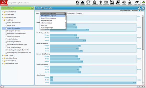
Code Application by Descriptor Charts
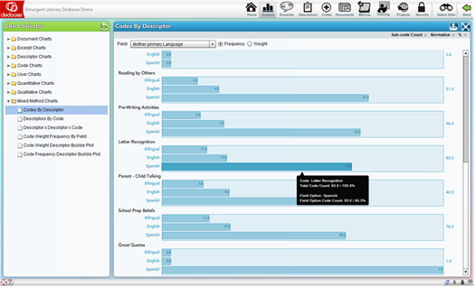
The Code Application by Descriptor charts (including the charts using Dynamic descriptors) have a number of options and can be some of the most useful visualizations for analysis, interpretation, and communication/presentation of research findings. Essentially, these charts represent the number of excerpts that have been associated with a particular code separately for each sub-group of a descriptor variable. For example, we can see the charts for the codes Pre-Writing Activities, Letter Recognition, … in the screenshot below broken out by the relative number of excerpts coded for each of the ‘Mother Primary Language’ groups of ‘Bilingual,’ ‘Spanish,’ or ‘English.’
The drop-down menu, allows for an immediate reconfiguration of the charts by selecting any of the list-type or grouped number or date/time descriptor fields in the project.
.
Other important controls for these charts can be found in the panel sub-header showing radio buttons next to the drop-down menu to switch the chart from relative excerpt count to average weights applied and check boxes for ‘Sub-code Count,’ ‘Normalize,’ and ‘%.’ By default, the ‘Normalize’ and ‘%’ boxes are checked.
- The Sub-code Count checkbox (which defaults to ‘off’) allows the inclusion of all code children, grandchildren … to be included in the visual – essentially collapsing upward in the code tree. For example, if the Parent-Child code had child codes associated with it in the tree, all excerpts coded with Parent-Child Talking AND the child codes would all be included in the chart for Parent-Child Talking
- ‘Normalization’ adjusts each bar based on the relative number of cases in each sub-group. Simply, a graphical representation for code application frequency by sub-group is relatively meaningless if there are unequal numbers of individual cases across each sub-group. For example, in this study, the ‘Spanish’ group for ‘Mother Primary Language’ is disproportionally large (representing 64% of the total sample). Turning off the normalization adjustment results in a possibly misleading visualization. Below is the same chart as above with normalization turned off:
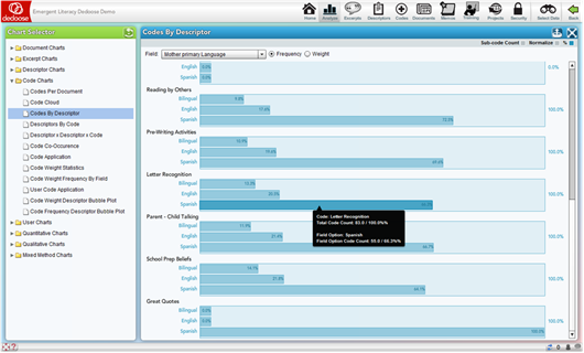
This ‘non-normalized’ chart, as compared to the original, appears to suggest a markedly high frequency of ‘Letter Recognition’ coded excerpts for the Spanish group. Hence, normalized charts provide a more unbiased perspective of the underlying data
- The ‘%’ check box converts the chart from a raw count presentation to a percentage basis presentation, as shown in the following snapshot of the same chart with the percentage view deactivated:
Code Application by Descriptor Charts for Dynamic Descriptor Fields
The Code Application charts across dynamic descriptor fields are a special case of code application by descriptors. These charts are markedly different in their meaning. As dynamic fields are designed for longitudinal analysis, the charts are presenting change over time in the code or weight application activity for each code.
Descriptor by Descriptor by Code Application/Weight Charts
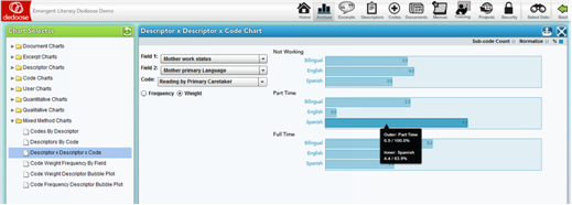
The Descriptor by Descriptor by Code Application/Weight chart has a great set of options for drilling even deeper into variations across population subgroups. These ‘nested’ charts allow for examination of the qualitative data and coding/weighting activity based on two descriptor variables. The example below shows the relative average weight assigned to excerpts coded with ‘Reading by Primary Caretaker’ across ‘Mother Primary Language’ within ‘Mother Work Status’ subgroups. These charts can expose variation in value, sentiment, importance, quality, or anything you have used the weighting system to represent) at deep levels in the overall population. In the example, we see an interesting interaction pattern with variations in the levels of primary caretaker reading quality dependent on both mother language and work status (i.e., excerpts were rated generally higher – better quality reading practice – for those coming from families with part-time working and Spanish speaking mothers and full-time working bilingual speaking mothers as compared to other sub-groups).
Code Weight Frequency by Descriptor Field
The Code Weight Frequency by Descriptor Field Charts allow for a focus on the code weight distribution across descriptor field categories. The following example is based on the ‘Reading by Primary Caretaker’ code and the ‘General Home Language’ descriptor field. The resulting chart shows the number of cases in each descriptor sub-group, i.e., Bilingual, English, and Spanish, for each Reading by Primary Caretaker code weight. The bottom set of bars shows that of the 22 excerpts assigned the Reading by Primary Caretaker code with a weight of ‘5,’ 11 were English speakers, 7 were Spanish speakers, and 4 were bilingual speakers at home
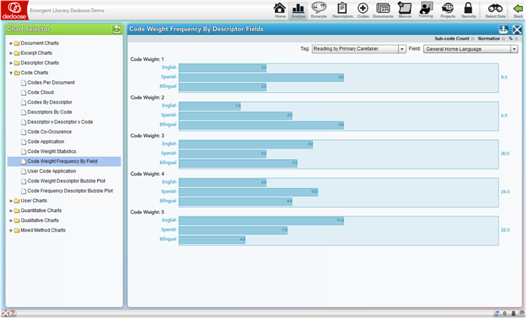
The Code Weight Frequency by Descriptor Field charts is a prime example of how mixed methods can expose important patterns in research data. Well designed code weight systems are ‘grounded’ on the underlying qualitative data – they are based on data from the sample population. Valid and reliably applied weight systems:
- Help generate clear illustrations of how coded qualitative content is distributed as a function of the associated weighting system
- Represent quantitative distributions of cases within the sample population across code applications, i.e., defining and exposing patterns of specific code application across the population – providing both numerical information on cases based on the code’s content and a ‘grounded’ definition of each weight value
- Expose descriptor sub-group variation in the application of each code
- Provide numerical representations of qualitative content that can be exported for use in other quantitative analysis
Code Weight by Descriptor Bubble Plots
The Code Weight by Descriptor Bubble Plots allow for a four-dimensional exploration and presentation of project data. These plots are based on the average weights associated with the selected codes across the selected descriptor field sub-groups.
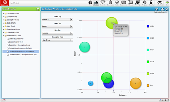
In the above example, from a study on the hotel characteristics reported as desirable across age and income level, the bubbles represent different age groups. The size of the bubbles represents the average weight associated with application of the ‘Service’ code, which has been applied when service was mentioned as a desirable characteristic and a weighing to indicate the reported level of importance. The X and Y axes show the average weights associated with the application of ‘Intimacy’ and ‘Décor’ codes respectively. The highlighted bubble indicates that respondents 45-49 years of age or report relatively high importance for ‘Service’ and ‘Décor’ and only moderate importance for ‘Intimacy’ as compared to the 50+ age group who rated both ‘Service’ and ‘Intimacy’ relatively highly, but ‘Décor’ was far less important in their hotel decision making.
Where weight systems have been associated with code application (e.g. to indicate importance, strength, sentiment, value), these plots can quickly expose complex multi-dimensional relations between variables across sub-groups.
Easily and quickly modified through the drop-down menus, bubble plots can communicate a tremendous amount of information, be used to access the excerpts represented by a particular bubble, and be used as filters for further analysis.
Code Frequency by Descriptor Bubble Plots
The Code Frequency by Descriptor Bubble Plots allow for a four-dimensional exploration and presentation of project data based on the frequency with which particular codes were applied to excerpts across the selected descriptor field sub-groups.
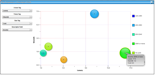
In the above example, from a study on the hotel characteristics reported as desirable across age and income level, the bubbles represent different annual income groups. The size of the bubbles represents the frequency with which the ‘Cost’ code was applied to excerpts within each sub-group. The X and Y axes represent the frequency with which the ‘Luxury’ and ‘Warmth’ codes were applied respectively. The highlighted bubble indicates that in comparison to other income groups, respondents reporting annual incomes of $250K or greater discuss issues of Luxury and Cost in hotel evaluations relatively more frequently and issues of Warmth relatively less frequently.
These plots quickly expose complex multi-dimensional relations between the applications of codes across sub-groups and facilitate the identification of important patterns in respondent opinions regarding the research questions.
Easily and quickly modified through the drop-down menus, bubble plots can communicate a tremendous amount of information, be used to access the excerpts represented by a particular bubble, and be used as filters for further analysis.
Code Co-Occurrence Table
The Code Co-Occurrence Table provides information about how the code/tag system was used across all project excerpts. These symmetric, code by code, matrices present the frequencies for which all code pairings were applied to the same excerpt. Such a display can expose both expected and unexpected patterns in which two codes were (or were not) used together. These patterns illuminate how concepts related to the research questions and represented by the code system are combined in the natural schema (i.e., cognitive frameworks that help organize and interpret information) activated by study participants as they respond to interview or focus group protocols.
What does it tell us about our data and research questions when we discover that that codes ‘A’ and ‘B’ co-occur at relatively low rates compared to codes ‘A’ and ‘C’? Dedoose facilitates the process of addressing questions like these quickly and with a variety of attributes to suit the needs of different researcher preferences. It is also important to note that by default this table also includes counts for overlapping excerpts. That is, the cell values represent ‘hits’ for excerpts coded with both the associated codes AND excerpt with one of the codes that overlaps with an excerpt coded with other code. This feature can be deactivated by clearing the ‘Include Overlapping Excerpts’ box in the upper right corner of the panel.
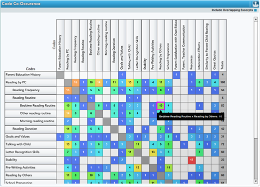
For example, the highlighted cell in the table above indicates that 10 excerpts or overlapping excerpts were coded with both the ‘Bedtime Reading Routine’ and ‘Reading by Others’ codes. This pairing’s relatively high frequency indicates that as participants are thinking and reporting on one of the concepts, they often discuss thoughts about the other. Such a combination suggests that an overarching schema which includes both concepts is being activated as participants formulate their responses. Drilling down to the underlying qualitative data (by clicking the cell and reviewing the excerpts) provides a deeper understanding of participant reports and the naturally occurring patterns in their thought processes.
Observation of patterns in how the code system was applied can illuminate a wide variety of connections within (a) the nature of the conceptual framework represented by your code/tag system and how it was applied and (b) the nature of the data themselves. Again, patterns like these are unlikely to be noticed and would be extremely difficult to track when you you’re your team) are engaged in the coding process. Yet in the analysis stage, many researchers seek to find such patterns to help formulate the organizing principles they will use to understand and present their findings and how research participants naturally describe their responses to key research questions.
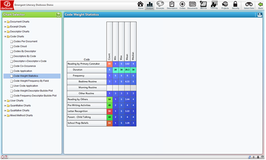
Code Weight Statistics Tables
The Code Weight Statistics Tables offer another means of examining and understanding coding activity in the project. These tables display basic counts and, where appropriate, statistics of how the weights for each code were distributed across the code applications. The application count cells are also great shortcuts for activating a code-specific filter or pulling up all excerpts associated with the code for further exploration
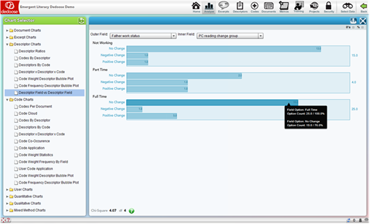
Descriptor Field vs Descriptor Field
The Descriptor Field vs Descriptor Field chart is essentially a cross-tab analysis of the relative frequency of member in each sub-group plotted for two descriptor fields – one nested within the other. For example, in the screen shot below, you see ‘Father Work Status’ graphed against ‘PC Reading Change Group.’ The result of the analysis is Χ2 = 4.07 with 4 degrees of freedom – not a statistically significant relationship. This non-parametric statistical analysis is commonly reported in the description of a research project participant population and in discovering how the population may have interacting characteristics that should be understood and considered in the interpretation of study results
Eli Lieber 2014