Using Software in Qualitative Research
A Step-by-Step Guide
Student Resources
Chapter 10 – Managing Interpretations (MAXQDA)
Download the pdf for this chapter guide here.
Chapter 10 in the book is all about managing interpretations; managing where and how you make analytic notes, using software structures to ensure your thoughts do not get forgotten or your notes lost. Ways of expressing or visualizing connections and relationships are sometimes provided in software and help in the generation and management of the ideas that you have about the data. The literature that informs your work is very important and these software programs can be used in many different ways to manage cross referencing with substantive data or to manage the literature review itself. See all coloured illustrations (from the book) of software tasks and functions, numbered in chapter order.
Sections included in the chapter:
Writing as continuous analysis
Critical Appraisals of literature
Analytic memos
Process memos
Definitions
Linking notes to data
Integrating notes with other work
Visualising memos
MAXQDA11 and Case Study B – Create spaces in which to write
All the different types of memos
The main spaces in MAXQDA11 for your own writing are called “memos”, although there are some other routines to be described below. Here is a list of the various possibilities available to you along with a note of how to create a new item of each type.
- Logbook – (“Memos > Logbook” or Alt+Q) – there is only one logbook per project.
- Free Memo – (“Memos > New free memo”)
- Document Memo – (right-click context menu in Document System)
- Code Memo – (context menu in Code System)
- Memo attached to text – (context menu in Document Browser or double-click in the memo margin)
- Comment on a coded segment – (context menu on the code bracket)
- Summary Grid – (“Summaries > Create and edit summaries”) – see separate exercise.
In some circumstances you may also wish to create one or more documents within the Document System and write your own materials in those using the editing functions available on the Code toolbar, and you can also convert a memo of any type into a document.
Editing memos
All of these writing spaces can be edited as many times as you like after they have been created. Where they appear on the screen attached to an element in your project (document memos, code memos, memos attached to text, and comments on coded segments) they can be accessed for editing with a double-click on their memo icon or through the right-click context menu at that element.
Basic formatting tools, such as different fonts and colours, and a button to insert a current date are available for all of these spaces except the comments on coded segments. Figure 10.1.1 shows a document memo being edited; the code memos and memos attached to text have very similar screens and work in very similar ways.
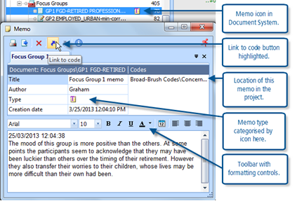
Figure 10.1.1 – Editing a document memo
In Figure 10.1.1 a document memo has been re-opened for editing by double-clicking on its post-it note icon in the Document System window. The toolbar at the top of the memo window has buttons to print or export the memo, a red “X” button to delete the memo (not something to be done hastily), a “Link to code” button which is highlighted in this illustration, and a Remove link (from code) button. Beneath this toolbar is a tab showing the title of this memo, this can be directly edited in the title field just below.
Between the title and its editing field is a dark blue bar with information showing in a white font. The left portion of this bar shows the location of the memo - “Document: Focus Groups\GP1 FGD-RETIRED” – this is telling us that this memo is attached to a document, in the Focus Groups group in the Document System, called “GP1 FGD-RETIRED …” (there is not enough space to show the full document name). This information bar can be helpful in reminding what sort of memo you are looking at; for code memos it starts with “Code” and then shows the group and name of the code concerned. For free memos this bar is empty. A memo attached to text shows the location of the document in which it is held.
You can choose between 11 symbols to categorise each memo, all variations on the post-it note design, by clicking in the “Type” field and opening a drop-down menu there. It is up to you to impose your own meanings on these symbols, but if used consistently they can help you to sort your ideas. In particular you could use some of the symbols to distinguish memos about the process of your research from those discussing the emerging concepts in the data.
You should experiment with the formatting facilities in the toolbar just above the memo text field. The variations that you include in the text of your memos will be displayed and used wherever the memo is shown or exported.
Linking memos to codes
In Figure 10.1.1 (above) the button for “Link to code” is highlighted, and in a field on the right of the window you can see that this memo is already linked to the code “Broad Brush Codes/Concern …”. You should now consider the methodological and practical implications of this facility, which is available for free memos, document memos, code memos and memos attached to text. (It probably seems tautological to link a code memo to its own code with this function since it is firmly attached to that code anyway).
You can only link whole memos to codes with this facility, you cannot code a segment or phrase within the memo. But you can link one memo to any number of codes in this way. The advantage of making such links is that you can subsequently start from a code in the Code System and by using its context menu ask for “Overview of linked memos”; this opens a subset of the memo manager, listing all of the memos that have the selected code in their links field. This is similar to retrieving all of the segments of source data linked to that code, but it retrieves all of the memos of your own thoughts linked to that code. This is a powerful aid to organising your ideas as you work through your project. Whenever you create or edit a memo that concerns the themes or concepts you are studying you should try to link it to the relevant codes then, later on, you will be able to bring all of those ideas back together for each theme and consider how to refine and develop them further.
TIP: You don’t have to use the same thematic codes that you have set up for analysing the data with your memos. You could create some separate codes just for connecting your ideas recorded in memos, these might include a code for each main strand of your research question so that you can link emerging ideas directly to your end goals.
Finding and managing memos
The Memo Manager option (from the “Memos” menu) provides a table view of all of the memos in your project. All of the comments on coded segments can be located in the “Overview of coded segments” option in the “Codes” menu, which is also set out in a tabular layout. These tables can be sorted on any of their columns by clicking on the title field at the head of the column.
Within the Memos menu you have options for “My code memos”, “My document memos” and “Memos of the opened document”. These options open up subsets of the Memo Manager in table format. “My document memos” extracts just the memos attached to the text within documents, it does not appear to report on the memos whose icons appear in the Document System window beside each document there, so it could be thought of as “My text memos”. Whereas the option “Memos of the opened document” will give you all of the text memos for the document currently showing in the Document Browser window as well as that document’s single Document Memo.
You should explore these tables and their outputs (via the toolbar at the top of each manager window) because you can generate a wide variety of reports and formats with them. Experiment with sorting the tables according to the memo titles as another way of grouping memos that have some connections between them.
Words or phrases in memos can be searched for with the Lexical search function (using “Analysis > Lexical search” or its icon on the standard toolbar) and clicking on the “in memos” radio button in the parameters section on the right of the dialog where you specify the search terms. This does not include the comments on coded segments in such searches, so the best way of locating one of those will be to select the relevant code in the Code System and then use the “Overview of coded segments” option from the context menu for that code which lists only the segments for that one code and shows the comments in the 2nd column of the table.
You may also try organising some of your memos within MAXMaps (see the next chapter for more information about mapping ideas). For example, if you have linked a number of memos to a particular code you could import that code into a new map along with all of its memos. Then, in the map you could drag the memos into several groups where they have ideas in common and this layout may help you to develop your thinking about this particular theme onto a higher level.
Comment on a coded segment
You can make a brief comment about each application of a code to a segment of data. It is not essential, and it would greatly slow the process of coding if you did this on many segments, but there will be occasions when you want to record some thought about a particular coding decision.
To add or edit a comment, first apply the code in one of the usual ways then use a right-click on the code bracket or its label to open a small context menu, from which you should choose the 2nd option “Edit comment”. This opens a small dialog window with a simple text field into which you can type your comment. Figure 10.1.2 illustrates this.
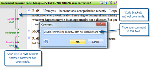
Figure 10.1.2 – Commenting on a coded segment
You have space for a maximum of 127 characters for each comment (so it is a bit like Twitter). The “OK” button completes the procedure, while the “Cancel” button will close the dialog and ignore any changes you have made. Note how the small circle in the middle of the code bracket becomes a disk of solid colour when a comment has been made (see the bracket for “..Security” in Figure 10.1.2 and compare it with that for “..Debt” above).
You can also open the comment dialog with a double-click on the code bracket or its label, or with a double-click on the yellow information box beside a segment in the Retrieved Segments window.
You can edit an existing comment by opening it in any of the ways just described, but at first the existing comment will be shown in white font on a blue background in the field. If you start to type you will lose the entire comment and your new comment will take its place. So, if you only want to make a small change to the existing comment without having to retype it altogether, you should press the “End” key or the left or right arrow keys on your keyboard to jump to one end of the comment or click with your mouse somewhere in the comment to turn the font into black text on a white background; you can then move over the existing comment before making your changes and storing them with the “OK” button.
You can view a comment by holding the mouse pointer over a code bracket with a solid colour disk. The comment text will appear in a temporary information box.
These comments can also be viewed and edited in the table “Overview of coded segments” which can be opened from the right-click context menu on a document name in the Document System window. This table will show all of the coded segments in the selected document.
Alternatively, after retrieving a selection of coded segments with activations, you can view and edit the comments in the Retrieved Segments window by opening the “Overview of retrieved segments” additional window (6th icon in the Retrieved Segments window toolbar or use the keyboard short-cut Shift+Ctrl+L), or by switching to “Table view” with the 1st icon in the Retrieved Segments window toolbar.
TIP: Sometimes you may want to add the same comment to several coded segments, this would be done most easily in one of the table views with copy/paste operations.
The Logbook
The Logbook has been designed as the place to store your project diary. If you use the “New logbook entry” button on the toolbar within the logbook window, it will create each new entry at the top of the list and insert the date and author all in a single step. In this way the items will be listed in reverse date order, with the most recent at the top.
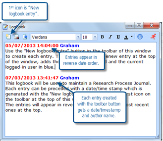
Figure 10.1.3 – the Logbook
The lexical search function does not look inside the Logbook, so this would not be a good place to write your analytical thoughts because they may prove harder to locate afterwards. But when you merge projects in a teamwork situation, or merge codes as you reorganise your coding schema, entries here in the logbook which record those activities and the date on which they happened could be invaluable in helping you to identify which back-up file to use to get back to some lost information.
Convert a memo to a document
You can convert any single memo into a document held in the Document System with a simple context menu option. This works with Free memos, Document memos, Code memos, and Memos attached to text. For any of these items, select the memo icon in its appropriate window with a right-click and use the context menu option “Convert memo to a document”. This same context menu can also be opened with a right-click on a memo’s row in any of the table displays of memos such as the Memo Manager.
The process is extremely simple, there is no confirmation dialog, and the new document will appear at the top of your Document System with the same name as the memo had. The memo title, author and date of first creation will be inserted as text at the top of the new document, with the full text of the memo following below.
You should think carefully about the methodological implications of such a conversion and how it might be useful in your analytical process. The advantages of having your own thoughts saved in a document include the facility to hyperlink segments of the memo/document to segments in your source data, and the facility to apply thematic codes to separate segments of your memo/document. These facilities do not exist for memos. The disadvantage may be that you more easily tend to confuse your own writing with the source data, as outputs from the Retrieved Segments or Visual Analysis tools could include a mixture of both.
In conclusion
The main limits on what can be achieved with the various writing tools in MAXQDA11 are set by your own imagination. There is considerable flexibility in the program to allow you to tailor these facilities to your own ideas. It would be a good idea to return to this exercise from time to time to make sure that you have not missed some further possibilities to improve your skill at applying these tools and so derive even greater benefit from their use.
MAXQDA11 and Case Study B – Using the Summary Grid
The Summary Grid is a new feature in MAXQDA11. It is a space in which you can summarise your ideas about each thematic code, document by document. This should be helpful in the process of data reduction as a way of making a large volume of source material accessible as summaries of ideas associated with each code.
There is a two-stage process for creating summary grids. In the first stage you look at all of the segments to which a code has been applied in each document and write your own summary of those segments. In the second stage you call back these summaries for one or more codes laid out in a table with one cell for each document. In this way you can move steadily from the source data to a synthesis of all of the ideas you have found therein for each code.
Stage 1 – writing summaries
You can start a new set of summaries by using the menu option “Summaries > Create and edit summaries” or by using its icon which can be found on the standard toolbar. You may want to limit the range of material to consider at any one session of summarising by using activation to identify the documents and codes with which to work, so activate an appropriate document group and a few codes before starting the summaries.
The window for editing summaries has three panels, side by side. The left-most panel has a table like the Code Matrix Browser showing codes in rows and documents in columns. If there are any segments in a document to which a particular code has been applied then there will be a blue disk (or square) in the table at the cell where that document column and code row intersect. When you click on one of these blue symbols in the left panel then all of the segments that match that combination of document and code will be displayed in the central panel. After reading those segments carefully, you can type your own summary of them in the right-hand panel. When a summary has been entered a shading box appears in the table in the left panel at the cell where that document and code intersect.
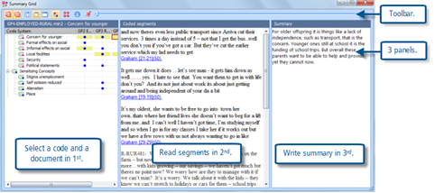
Figure 10.2.1 – Creating a summary for the Summary Grid
In Figure 10.2.1 the three panels can be seen. Note how the display in the middle panel changes each time you select another code/document intersection in the first panel. The right-hand panel will be empty until you start to type your own summary in there.
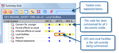
Figure 10.2.2 – Thematic Grid element of Summary Grid window
The left-hand panel may be called the “Thematic Grid”. In Figure 10.2.2, which is a closer view of this panel, you can see three of the Focus Group documents are showing in columns (“GP2..”, “GP3..” etc.), and some of the thematic codes are listed as row titles. The blue circles indicate in which documents each code has been used (note that there is no indication of how many times a code has been applied, all of the circles are the same size). The yellow rectangles either side of some blue circles indicate where a summary has been written already (so none of the segments for code “Security” have been summarised yet). The red outline at document “GP3” and code “Local facilities” indicates that this is the cell currently being summarised in the other 2 panels.
Note the toolbar near the top of Figure 10.2.2. The first 6 buttons apply to this Thematic Grid panel only. The first 2 are used to limit the display in the table to just the documents and/or just the codes which have been activated, and in this illustration they are highlighted indicating that such a restriction is in force. The next 3 buttons all operate on the columns in the thematic grid and they control the width of these columns and the amount of the column name to be displayed. In this illustration the middle setting has been used. You might think about the circumstances where you would want to have no apparent identification of the document being analysed (the narrowest option), or alternatively to only see one document at a time in the table (the widest option). The 6th button toggles between circles and squares as the symbol in the grid.
For the moment, ignore the 7th button because this can be used to jump into the second stage of the process, after the summaries have been written. But note the slider bar which can be seen to the right of the “running man” exit button – this slider works to move the columns across the thematic grid panel while still showing the code names, so it is very useful when you have more than a few documents to summarise (and it works better than the Windows scroll bar at the bottom of the panel).
The middle panel of the display should be self-explanatory as it shows all of the segments in the document selected in the thematic grid that have been applied to the code selected in the thematic grid. There is a scroll bar to move up and down this panel if there is more text than can be seen at any one time. This is the source data that has to be summarised or interpreted in the data reduction process.
Note that there is no code labelling in this middle panel as all of the segments shown there have the same code applied to them, the code indicated by the location of the red outline in the thematic grid panel. Similarly, they all share the same document source, as shown by the column with the red outline in the thematic grid. Beneath each segment is an indication of the person who applied the code originally (taken from their log-in identity) and the paragraph number for that segment in the source document – these are shown in underlined blue font. If you click on one of these identifiers the segment will appear highlighted in the Retrieved Segments window (behind the grid window) and also in the Document Browser so that it can be read in its original context if necessary.
It is up to you how you decide to summarise the coded segments that you can see in the middle panel and type your ideas in the right-hand panel. You could try to condense the source’s words into a few key words or phrases, mainly using their words. Or you might try to paraphrase their contribution by using your own words. Or you might try to write an interpretation of what this source is contributing to your understanding of the topic. Whatever you attempt, you should be brief – just a few lines is enough, as you will see when you move to the second stage.
Stage 2 – the Grid Table
When you have summarised several codes across their key document sources you are ready to look at the Grid Table to see your summaries in proximity to each other. An illustration of this is set out in figure 10.2.3 below.
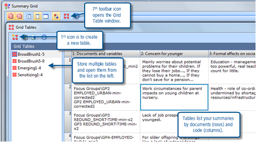
Figure 10.2.3 – A Summary Grid Table
You can open the Grid Table window from several places with its distinctive icon (which can be seen on the standard toolbar of the main workspace, on the Summary Grid toolbar, and in its header bar in this illustration) or by using the menu option “Summaries > Grid Tables”.
You can save multiple grid tables by naming each of them, and then re-open them with a double-click on their name in the list to the left of the Grid Table window. Create a new table by clicking on the 1st icon in the toolbar of the Grid Table window.
When you start a new grid table you have to complete a parameter dialog to determine the contents of that table, this is illustrated in Figures 10.2.4 and 10.2.5 below. There are separate tabs in the parameter dialog for selecting the documents and the codes.
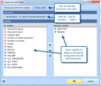
Figure 10.2.4 – Selecting documents and variables for a new grid table.
Figure 10.2.4 shows the tab for selecting the documents. You have 2 options, either all documents or just the currently activated documents. In the grid table there will be a row for each document that you choose to include, so if you have a large project and you set this to “All documents” you will end up with a very long grid table. If you choose to activate only some documents and then apply the option for these only, then this selection of documents will be stored when you save this particular grid table and the next time you open it the same selection of documents will be displayed in the table irrespective of the activation settings in the project at that later time.
The 2 panels in this dialog for selecting variables are only concerned with displaying information, there is no functional selection aspect associated with this part of the dialog. The value for each selected variable will be displayed beneath the document’s name in the first column of the grid table.
When you have selected the documents to be included and any variable values to be displayed with them, you should move on to selecting the codes by clicking on the second tab and bringing up a dialog like the one shown in Figure 10.2.5 below.
The codes to be displayed in the grid table are selected by clicking ticks into the check boxes beside their names. Groups of codes can be expanded or minimised but each code has to be selected individually, there is no facility to select a whole group through its header code.
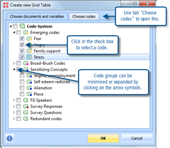
Figure 10.2.5 – Selecting codes for a new grid table.
To begin with it is probably prudent to select only a few codes at a time for a new table, as each code will require its own column in the grid and it may be difficult to interpret a table with many columns of summaries.
When you click on the OK button at the foot of the parameter dialog the grid table so specified will be opened showing the summary comments that you have recorded for each combination of document and code. As can be seen in figure 10.2.3 above, in the grid table the documents form the rows and the codes form the columns. You can move around the table with the horizontal and vertical scroll bars to see cells that are not immediately visible.
A new table will be allocated the default name of “New Grid Table” but you can change that through the “Rename” option in the context menu on that label to something more meaningful in your project.
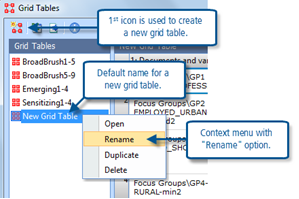
Figure 10.2.6 – Naming a new grid table
These tables are dynamic in the sense that if you add more text to a cell in the editing part of the summary grid, then that additional text will be shown the next time you open a grid table which includes that cell. They also interact in that if you change a summary comment in the grid table then that change will be reflected when you next edit a summary grid that contains that particular cell.
Using the Summary Grid and Grid Tables
As always, it is up to you how you make use of this facility in MAXQDA11. It is a way of helping you to focus on selected elements of the data and to record your thoughts about that data in a structured way. Note that any one cell (the intersection of one code and one document) has only one summary space but what you write in that space may be reported back to you in any number of different grid tables. This should make it easier to compare and contrast different elements of your data, whether that is different documents/sources or different codes/themes.
There is no designated space to write an overall comment on a particular grid table (a kind of summary of the summaries) but it would be quite straightforward to use a new free memo for this purpose and to include the name of grid table as part of that memo’s title.
If you are having difficulty moving on from the coding phase of your project then by using the summary grid processes you may find a way to develop more insights into your data.
Note also that there are buttons on the grid table toolbar for exporting the table to other programs. These may be extremely useful for sending some of your ideas to a colleague for discussion or consultation without burdening them with the full source texts.
Managing interpretations is enriched by being able to express things in a graphic sense. The mapping tool described in Chapter 11 helps the researcher to step back, draw connections and communicate them in a diagrammatic way if required. See mapping exercise next.
Graham Hughes and Stefan Radiker 2014
